UC map captures diversity of America
A geography professor built the most detailed map of racial diversity yet to study the way America's neighborhoods are changing.

By Michael Miller
513-556-6757
Photos by Andrew Higley/UC Creative Services
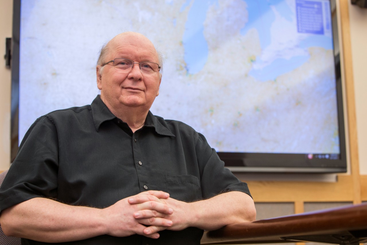
A geography professor at the University of Cincinnati repurposed NASA maps to show the changing racial diversity of every neighborhood in the continental United States.
Tomasz Stepinski, who previously served as a longtime researcher at the Lunar and Planetary Institute in Houston, Texas, applied NASA mapmaking techniques to 20 years of data collected by the U.S. Census Bureau to build one of the most detailed racial-diversity maps ever created.
The zoomable map shows at a glance how the racial composition of neighborhoods changed between 1990 and 2010.
“People don’t realize that the United States is a diverse country but at the same time is still very segregated,” Stepinski said.

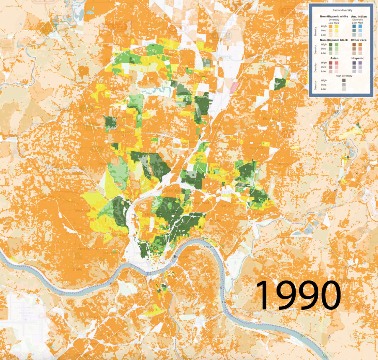
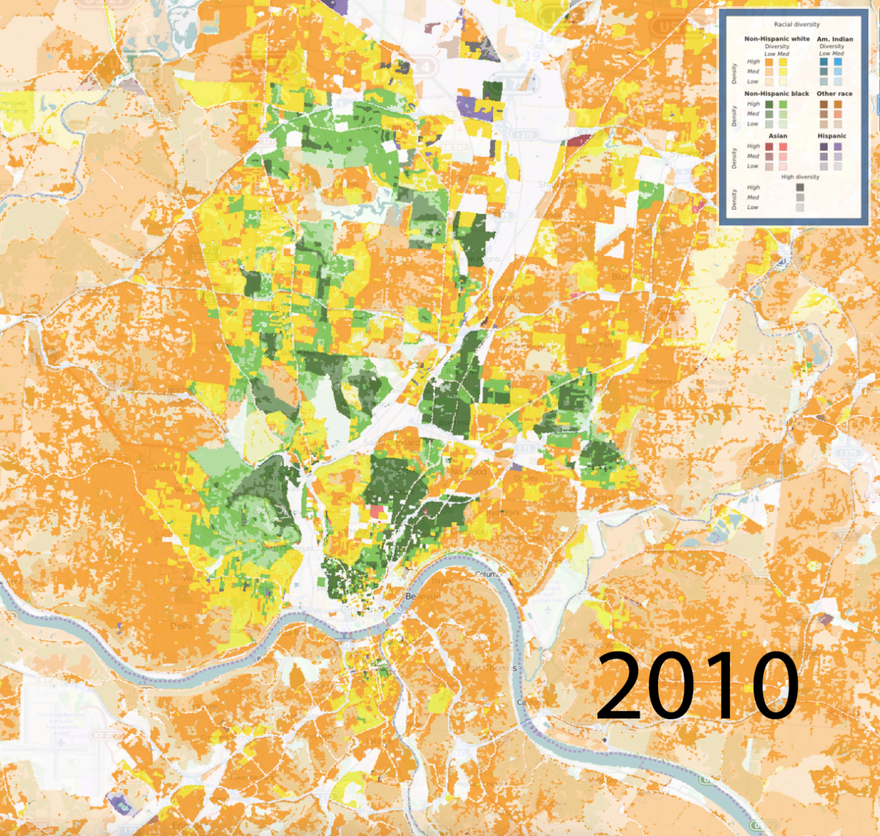
The maps created by UC's Space Informatics Lab show how neighborhoods in Cincinnati have become more racially diverse in the past 20 years. The maps provide the most detailed look yet at racial diversity in America.

The interactive map allows users to zoom in on neighborhoods to compare racial diversity between 1990 and 2010 or track expanding population.
Stepinski and his postdoctoral researcher, Anna Dmowska, created the map at UC’s Space Informatics Lab. They published a paper about the map in the open-access journal PLOS One in March and will present the project at the Population Association of America conference on April 27 in Chicago.
Stepinski, an astrophysicist, came to UC’s McMicken College of Arts and Sciences as a Thomas Jefferson Professor of Space Exploration in 2010. Prior to that he worked on methods for surveying craters and valleys in Mars for the Lunar and Planetary Institute.
His interactive map was the culmination of years of work to combine land-cover mapping techniques with cumbersome volumes of federal data collected every 10 years in the census.
“There is a lot of novelty to it,” he said. “All of it adds up to much, much easier access to census data by population and race.”
The interactive map is publicly available and will be hosted indefinitely on the university’s computer servers. Dmowska thinks it will have broad appeal to journalists, policymakers and researchers.
“The maps can tell us much more about racial composition and can be used by everyone,” she said. “They don’t require expert knowledge to understand the results, so I think maps can be used by a broader community.”
The U.S. Census Bureau has the ability to release data by household but compiles it into geographic blocks and tracts to protect individual privacy. After all, census takers collect sensitive information about household income that people might not want to share publicly.
A typical urban tract defined by the census occupies an area the size of nearly 3 square kilometers. Rural tracts occupy an area of 108 square kilometers.
This results in a visual map that by design isn’t particularly precise and, in some cases, might be grossly inaccurate, the researchers found.
By comparison, the maps that Stepinski and Dmowska compiled take advantage of NASA land-cover grids made up of 30-square-meter blocks. Using this grid system, they can more precisely group people where they actually live by recognizing lakes, parks, factories and otherwise uninhabitable areas.
“Then you can assign people to each 30-by-30-meter cell, down to fractions,” he said.
That’s right — down to half a person.
"You can tell a pretty powerful story about what segregation means."
‒ Jeffrey Timberlake, associate professor of sociology at UC
Few social scientists who study national data need maps that are so precise. But it’s very helpful when looking at particular cities or even neighborhoods over time, Stepinski said.
These at-a-glance comparisons could be of interest to researchers, journalists, political strategists and social-service agencies. For example, researchers could compare the population maps with separate data such as grocery stores, bus routes or medical clinics to examine whether any neighborhoods are underserved by government services or businesses.
“The closer you look, the more problematic census data becomes,” said Jeffrey Timberlake, an associate professor of sociology at UC who studies urban inequality and residential segregation.
Timberlake said Stepinski’s maps are useful to study change at the neighborhood level.
“I find them fascinating. I spent an hour just looking at it,” he said.
“When you look at a couple neighborhoods in Los Angeles, you see a big difference between 1990 and 2010 in the shrinking black population and the growth of the Latino population,” he said. “This is the kind of tool that could unlock a lot of research.”
Dmowska, who now works at the Institute of Geoecology and Geoinformation of Adam Mickiewicz University in Poland, said updating the maps in future census years will be relatively simple.
“Our grids are ready to use for multiyear comparison,” she said.
The maps allow users to create their own smaller study area and then glean data from it.
In some cities, they tell the story of recent immigration in America. For example, the maps demonstrate the influx of Asian immigrants in San Francisco over the last 20 years. Many of these newcomers are Southeast Asians who were drawn to the area by the Silicon Valley boom, Stepinski said.
And in Cincinnati, too, the census maps track the changing racial composition of the city. Neighborhoods that were predominantly white or black in 1990 are far more diverse now.
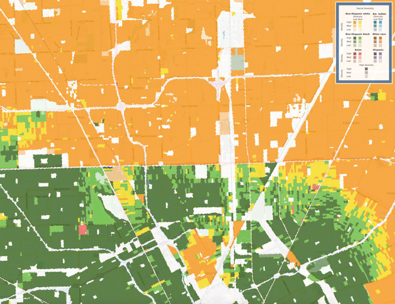
But they also show the way that racial segregation has defined some cities. For example, in the Detroit neighborhoods popularized by the Eminem movie “8 Mile,” the map from 1990 clearly shows the segregation of black and white communities on either side of 8 Mile Road. Here, too, neighborhoods have become less homogenous over the last two decades.
“If you put the population geography together with an understanding of the social meaning of that road,” Timberlake said, “you can tell a pretty powerful story about what segregation means.”

A 1990 map shows how Detroit was sharply segregated by race along 8 Mile Road.
Do you like geography? At UC, geography students tackle real-world problems. Apply to the Department of Geography or explore other programs on the undergraduate or graduate level.